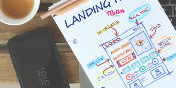
Most business owners assume good design means nice colors and fancy fonts. But those elements alone don’t guarantee strong conversion rates. In reality, it’s only possible when you apply specific psychological principles to your landing page design.
At www.mattersolutions.com, we help businesses use established psychological principles to create landing pages that convert their traffic into high-quality leads. We’ve seen how design elements like layout, color, and clarity build trust right away.
In this article, we’ll walk you through how design psychology impacts your conversion rate. We’ll also share practical optimization tactics and show you how to measure and improve your results.
Ready to see how your visitors’ minds work? Let’s get started.
The Role of Conversion Psychology in Design
Conversion psychology in design acts as a set of rules that guide how people process information and choose what to do next. If you want to design a high-converting landing page, you must understand how people make decisions when they land on your page.

Now we’ll break down the areas where psychology can upgrade an average page into a conversion machine.
Foundations of User Experience Design
User experience (UX) design is the process of creating products, websites, or apps that are easy, enjoyable, and meaningful for people to use. Cognitive ease, cognitive load theory, and visual hierarchy are the three foundations of effective user experience design.
- Cognitive Ease: When something looks simple and feels familiar, your brain relaxes and trusts it faster. A site that loads quickly, uses clear words, and looks clean feels easy to use, so people keep going without effort.
- Cognitive Load Theory: The brain gets tired if too much happens at once. For instance, a busy landing page with endless boxes, pop-ups, and text makes people give up quickly. Instead, clear layouts with fewer choices help visitors focus and take action.
- Visual Hierarchy: It refers to the way design guides your eyes to notice certain things before others. Usually, designers focus on size, color, contrast, and spacing to highlight main elements on a page, like a headline or button, and then lead you to supporting details.
Based on our experience, when you mix cognitive ease, reduced mental load, and clear visual hierarchy, your design feels natural and guides attention faster. This kind of design also makes it easier for people to say “yes” to what you’re offering (simplicity rocks!).
Structuring with Information Architecture
Information architecture is how you organize content so visitors can easily find what they need and understand your message without confusion. Just like a house needs a base before walls and a roof, your page needs structure before design or text.
Fundamentally, effective information architecture for your landing page consists of a few things. They include visual hierarchy, structured messaging, a progression from headline to benefits, trust-building details, and the CTA.
Let’s start with a clear visual hierarchy, which shows your visitors where to look first and what to notice next. It usually begins with a strong headline that grabs attention. After that, you share the main benefit, then add details that build trust. Finally, you point them straight to the call-to-action (CTA) button.
Here’s a shocker: most visitors don’t read word by word. Instead, their eyes follow patterns. For instance, on text-heavy pages, they usually scan the text in an F-shape. But on more visual layouts, they often move in a Z-pattern.
When you place your headline, benefits, and CTA along these paths, you guide visitors toward the action you want them to take.
Pro-Tip: Test your structure with real users by asking them to complete a simple task on your page. If they hesitate or get lost, your information architecture still needs work. Even a five-minute test can reveal gaps you’d never catch on your own.
Core Landing Page Optimization Strategies
Now that you see how psychology shapes choices, it’s time to get into the practical stuff. Great landing pages combine design and function effectively so every element builds trust and points to one CTA. Seriously, companies using this approach often raise conversions from 2-3% to 11%+.

Let’s look at the two areas where good optimization makes the biggest impact.
Unifying Landing Page and Interaction Design
The truth is, your page’s appearance and functionality decide whether people trust you enough to take action. That’s why your page needs to look professional and work smoothly at the same time.
Think of it like a store. If the lighting is bad or the checkout process is confusing, people leave without buying (you’ve closed a tab for way less, admit it).
In other words, great design choices can guide visitors exactly where you want them to go.
Here’s how the pros do it:
- Visual Elements: Colors and images grab attention and point visitors to important areas, like headlines or CTA buttons. At the same time, white space gives the design breathing room, reduces clutter, and makes scanning easier. It helps people understand your message faster.
- Functional Simplicity: You should cut your form fields down to only what you need and use clear action words on your buttons. For example, when BetterWorld removed an extra email entry step and swapped it for a single, clear CTA button on their landing page, they nearly doubled their conversion rate.
Applying Creative Thinking to Boost Lead Generation
Ever wondered how creative thinking can bring in more leads? It involves looking at your marketing approach with fresh eyes and finding new ways to connect with people. Rather than using the same old tactics, you use better ideas that build trust and guide your visitors to convert.
Consider these proven approaches:
- Benefit-Focused Copy: Write headlines that highlight the benefits people care about most. For example, instead of “We Install HVAC Systems,” use “Stay Comfortable All Year Without Outrageous Energy Bills.”
- Strategic Trust Signals: If you place testimonials and reviews near forms and CTA buttons, people feel more confident about sharing their information. Plus, add security badges for extra assurance, and you’ll see more visitors complete the action you want.
Boosting Website Conversion Rates
Here’s the thing about landing pages: building one is only the first step. The real progress starts after it goes live and you use data to improve it. Good businesses treat conversion optimization like a science experiment. They test ideas, track results, and make changes based on evidence.
In fact, the most successful companies never stop testing. Amazon, Google, and Netflix test thousands of page changes every year to get better results.
Feeling overwhelmed? Don’t worry, you don’t need their huge budgets to get started. However, you do need their “always improving” mindset.
So let’s dig into the two main ways to optimize your landing page for stronger lead generation.
The Process of Conversion Optimization
Think of conversion optimization as your landing page laboratory. A/B testing becomes your main tool for figuring out what works with real visitors. You should make two versions of your page, send half your traffic to each one, and let the numbers show you which one gets more conversions.
Want to know how to run these tests? Try headlines that address different customer problems. Then experiment with button colors and words to see what attracts visitors.
You can also adjust the number of form fields until you find the balance between collecting details and keeping the process quick (three fields is fine, but ten? That’s homework, man!).
In our experience, you need at least two weeks of data and enough visitors to ensure your results mean something.
Measuring Impact from Google Ads Traffic
Your ads and landing pages must tell the same story to your visitors, or they will leave instantly. For example, if an ad promises a “Free HVAC Inspection,” the landing page should show that exact offer with matching headlines and images.
Sadly, even small mismatches between ads and pages can confuse visitors and reduce conversion rates.
Now, once your message matches, the next step is tracking results. You can easily use Google Analytics to see which campaigns bring real customers. Then set up goals or conversions for actions like form fills or calls based on what the data shows.
Also, keep an eye on mobile results and page speed. That’s because slow or clunky pages drive people away before they even see your offer. Nobody wants that.
Pro-Tip: Track conversions separately for each device type. A landing page that works well on desktop often performs poorly on mobile. When you identify that early, you can adjust layouts, shorten forms, or improve speed for mobile visitors.
Get More Leads from Your Landing Pages
A successful landing page comes from understanding how people think, writing clear copy, and testing what works. The companies with the highest conversion rates understand their visitors well, and they design pages that guide people step-by-step toward taking action.
In this article, we’ve covered how psychology influences design decisions for better conversions and the optimization strategies that combine visual elements with functional simplicity. You’ve also learned the testing methods that measure real results from your traffic.
If you’re ready to increase your conversion rates, don’t hesitate to contact us at Matter Solutions. Consult with our expert team and find out how landing page psychology can improve your marketing results as well as grow your business.
Keep an eye for more latest news & updates on Tribune!


